Have you ever been somewhere where, no matter how many times you stared at the map, you still felt lost or trapped in a maze? Maybe you’ve stood at an intersection, unsure which direction will successfully lead to your destination. These complicated pathways are probably more common in large or complex spaces like airports, college campuses, hospitals, stadiums, or convention centers. Often, it’s most confusing the first time you navigate such a place, but even with repeated visits, you might still find yourself tangled in a web of intersections and pathways.
This brings us to the concept of wayfinding, an essential component of universal design.
What Is Wayfinding?
Wayfinding is a design system that combines architecture, interiors, lighting, landscapes, and information systems—like graphics, signage, and audible or tactile signals—to help people navigate spaces and reach their destinations. It’s about creating communication strategies that empower individuals to orient themselves and make decisions with ease.
Now, consider the additional challenges some people face: physical and cognitive impairments, sensory processing issues, language and cultural barriers, or differences in gender and social backgrounds. Universal design integrates all these factors to create inclusive wayfinding systems that guide everyone, regardless of ability or background.
For the purpose of this blog, let’s focus on universal design basics for signage, using airports as our example. Airports are notoriously stressful and congested, filled with people from all walks of life: toddlers waddling after parents, adults scurrying across intersections by foot or wheelchair, travelers with service dogs, and individuals relying on assistive technologies to navigate.
The Challenges of Poor Signage
A beautifully designed map with color-coded icons and a legend isn’t helpful if travelers can’t orient themselves within the space. For anyone navigating an airport for the first time, it’s easy to feel “disabled” by unfamiliarity. Getting lost in a busy airport can be overwhelming and anxiety-inducing—an example of how anyone can encounter barriers in various environmental settings.
Ask yourself these questions next time you’re in an airport or a large public space and how you will get from point A to point B:
- Do you know where to go as soon as you enter the building?
- Do you know whether to turn right or left at the top of the escalator?
- Are the signs visible, clear, and easy to follow?
If the answers are unclear, it could indicate issues such as:
- Lack of signage (visual, audible, or tactile).
- Poor placement or visibility of signs.
- Inadequate lighting on or around signs.
- Confusing or inconsistent symbols and arrows.
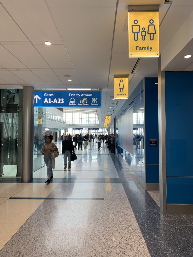
I’ve personally been misdirected by poorly designed signage in a hotel conference center, where the arrows led me to the men’s restroom instead of the women’s. And how many times have you struggled to find your gate, locate baggage claim, or pick up a guest at the airport?
Personal Experiences
As frequent flyers, my husband and I encounter these roadblocks regularly. Even with practice, we sometimes find it difficult to process wayfinding information in airports. Now imagine the challenges faced by someone with a language barrier, poor vision, cognitive delays, or exhaustion from a red-eye flight.
The World Health Organization estimates that 1.3 billion people globally live with some form of vision impairment, with the majority over the age of 50. These statistics highlight the importance of designing inclusive environments.
Examples of Great Wayfinding
Two airports that stood out for their excellent wayfinding systems are Dallas Love Field Airport and Charlotte Douglas International Airport. Here’s what they got right:
- Consistent, visible, and well-illuminated signage.
- Signs placed at every intersection, where they’re needed most.
- High-contrast colors to ensure visibility.
- Large icons and symbols that are easy to recognize, even from a distance.
- Universal icon language—simple and understandable for people from around the world.
- Color-coded pathways or sections to identify different areas.
For example, Charlotte Airport used yellow and blue font and icons on illuminated backgrounds. This consistency made it easy to locate restrooms, family restrooms, and even dog relief areas. The color-coded pathways guided us through the airport—even during ongoing construction—and made rental cars and terminal re-entry easy to find. We got caught in traffic and were cutting it short to get to the gate for take-off time, but because of excellent wayfinding information systems, I give them 5 stars for making our course super quick and easy to navigate! They get bonus points for listing the amount of time it takes to walk to each gate or landmark at every intersection!
Dallas Love Field Airport also excelled in wayfinding. Their signage used high-contrast colors, such as black on gray for general signs and white on illuminated blue for gate numbers. The destination city is projected at the gate, along with the next destination cities and the times of those flights below that will be leaving at the same gate. As someone with hearing loss, I appreciated being able to see updated departure information without relying on announcements. I almost missed a flight once because I was distracted sitting at the gate reading. I zoned out and did not hear the final announcement for boarding! I barely made it to the door before they closed the hatch!
How to Improve Signage
When designing or evaluating wayfinding systems, consider these key elements:
- Consistency: Use the same colors, fonts, and styles across all signs.
- Visibility: Ensure signs are well-lit and located where people naturally look for directions.
- Simplicity: Use universal icons and avoid overcomplicated designs.
- Contrast: High-contrast colors improve readability for everyone, especially those with vision impairments.
- Frequency: Place signs at regular intervals, particularly at intersections.
Final Thoughts
The next time you visit a hospital, convention center, airport, or any large venue for the first time, take a moment to reflect on how easy (or difficult) it was to navigate. If you have never been to Las Vegas yet, their signage and directions almost feel like a survival game for first-timers. Let’s just say, it took me an extra 30 minutes to get from place to place due to the directions dropping at every intersection while attending a convention in 2024. Effective wayfinding can reduce stress, save time, and make the experience more enjoyable for everyone.
As designers, travelers, or simply individuals navigating life, let’s continue to advocate for better wayfinding systems that meet the needs of all.
Resources to Learn More About Wayfinding